Against the grain, by design
Emily Rockit doesn’t play by the usual music-industry rules, and her brand needed to reflect that. Her work sits between rebellion and responsibility, challenging outdated systems while helping artists build sustainable careers on their own terms. The goal wasn’t to reinvent her voice, but to give it clarity, structure, and space to grow. This project focused on shaping a brand identity that could hold both edge and credibility — bold without chaos, expressive without losing trust. The result is a stripped-back, punk-inspired visual language designed to support storytelling, spark conversation, and evolve alongside the work.

The brief
Emily came to this project with a strong point of view and a clear sense of what she stood for — but the brand hadn’t yet caught up. Visually and strategically, things felt fragmented, making it harder for the message to land with consistency.
The brief was to create a brand that could:
Reflect Emily’s unapologetic, go-against-the-grain ethos
Feel credible and professional within the music industry
Support mentoring, advocacy, and long-form thinking — not just promotion
Speak clearly to the right audience without dilution
This wasn’t about creating something new for novelty’s sake. It was about bringing clarity and cohesion to what already existed.
The approach
This project, like all my work, was collaborative from the outset.
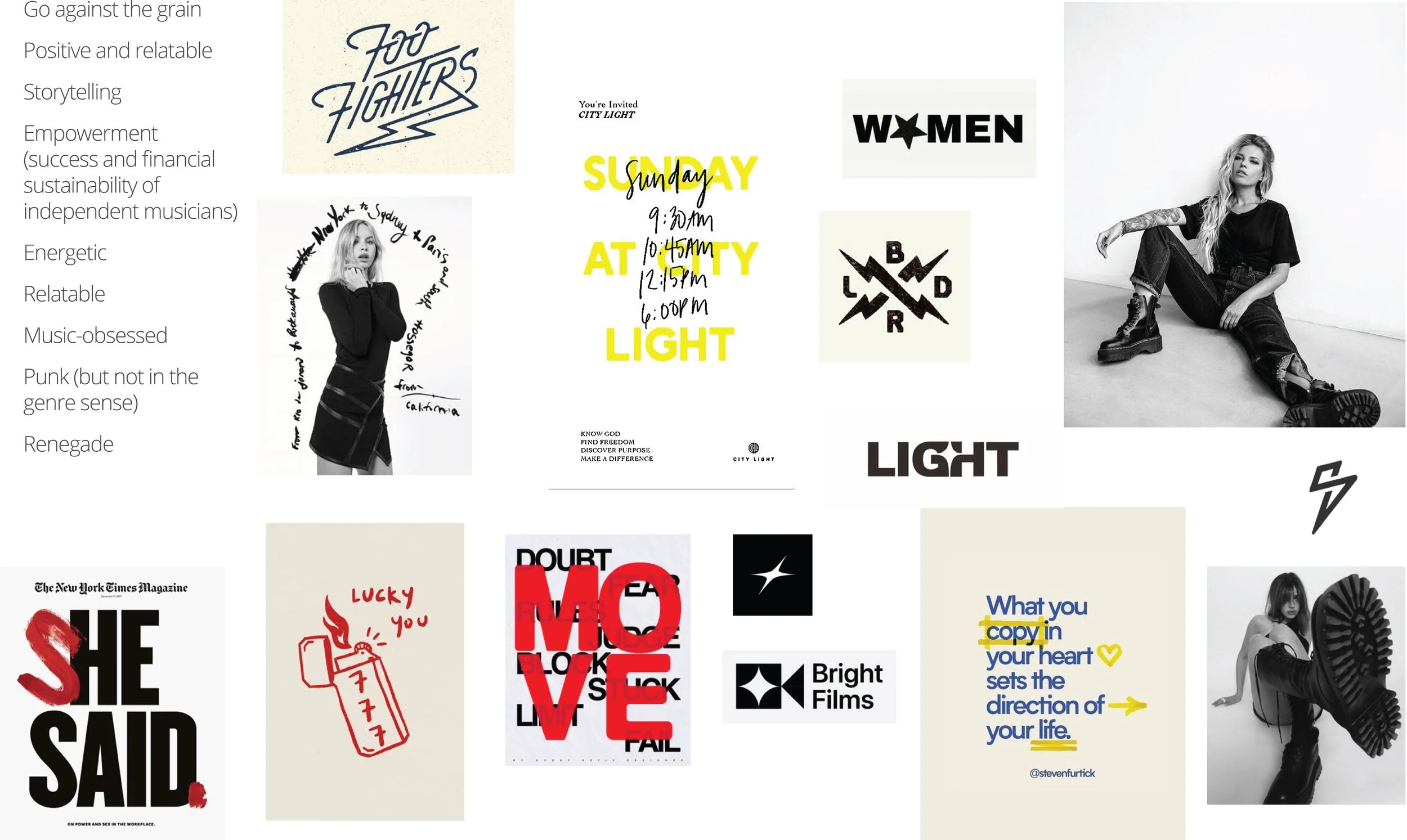
We began with a considered discovery process designed to slow things down and get clear. Emily completed an in-depth questionnaire, followed by an in-person discovery session where we unpacked her vision, values, audience, and long-term intent. From there, we reviewed the existing brand, explored competitors and industry leaders, and identified where Emily Rockit needed to stand apart — not blend in.
Together, we brainstormed ideas, tested language, and built mood boards and early visuals to help define tone, attitude, and direction. This groundwork clarified the heart of the brand: why it exists, who it’s for, how it shows up, and what it offers.
Emily Rockit lives in the tension between:
Rebellion ↔ responsibility
Raw honesty ↔ professionalism
Creative freedom ↔ trust and structure
Instead of smoothing out that tension, the brand was designed to hold it. Every decision was focused on alignment, not trends, ensuring the identity felt authentic, distinctive, and genuinely representative of Emily and the work she does.

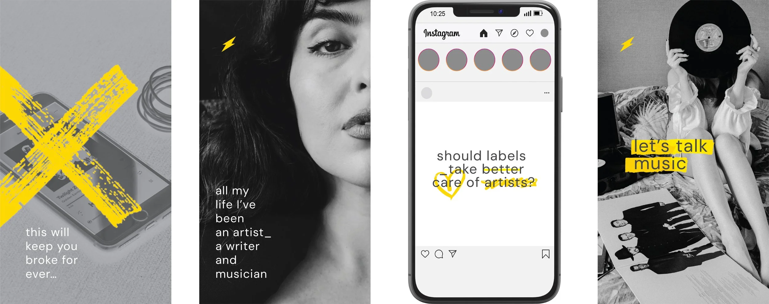
Concept before polish
Before refining the final applications, the brand was explored conceptually — testing how the system could behave, stretch, and speak. Early visuals focused on raw type treatments, plays on language, and loose graphic interventions, allowing ideas to surface without the pressure of perfection. This stage helped define the brand’s attitude and boundaries, ensuring the final outcomes didn’t just look considered, but felt intentional — grounded in message, emotion, and voice before being resolved into polished executions.
The identity
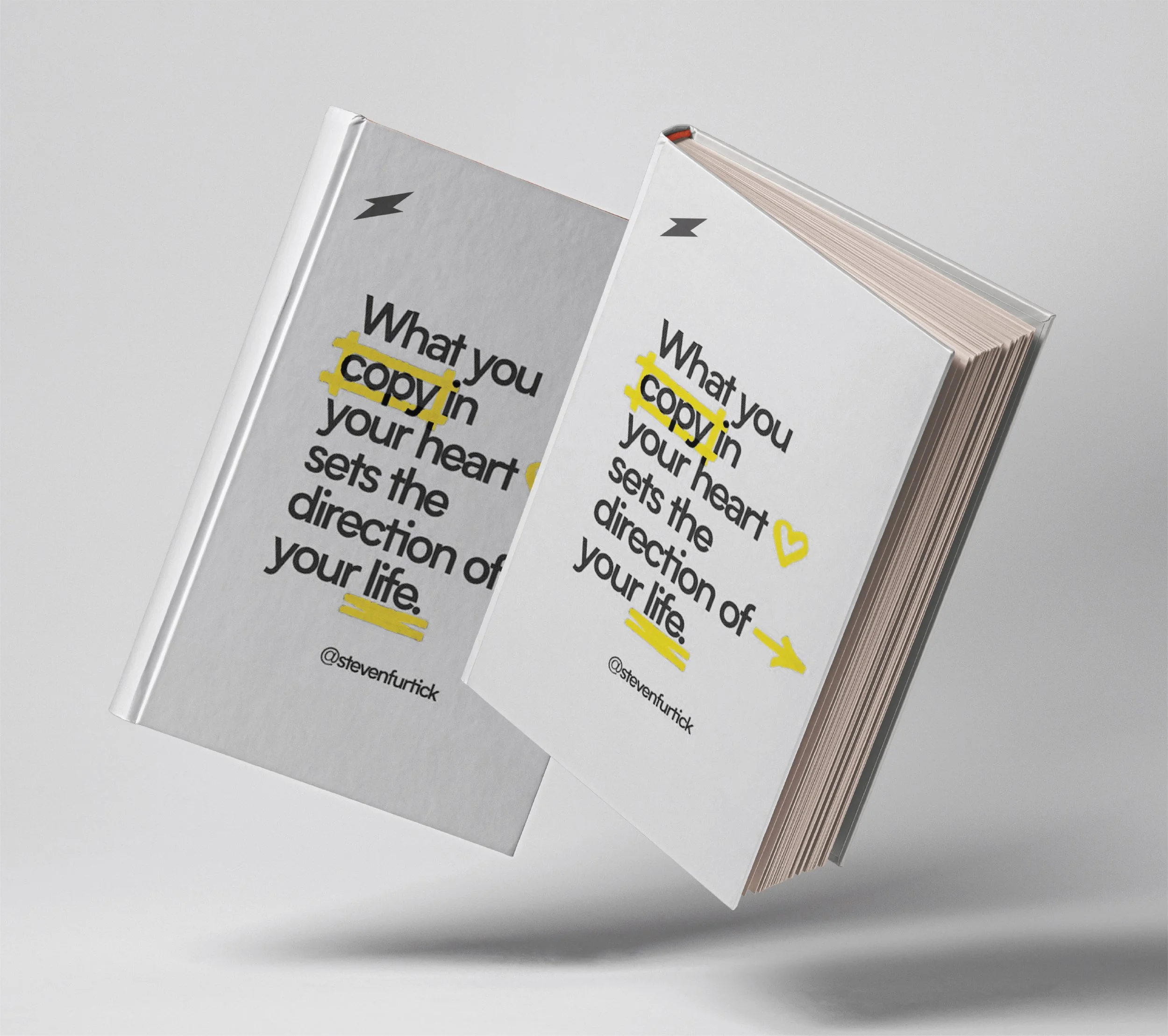
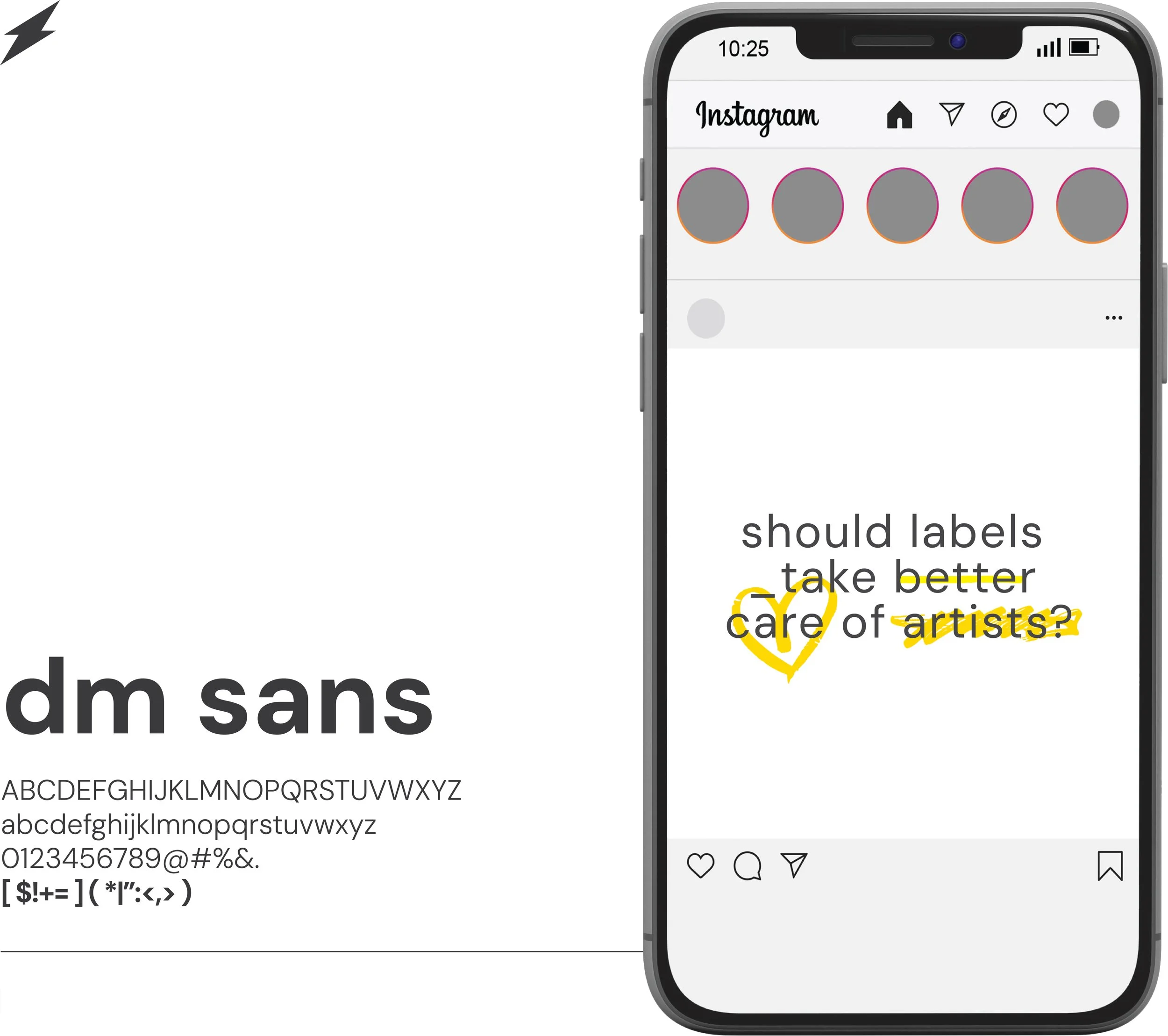
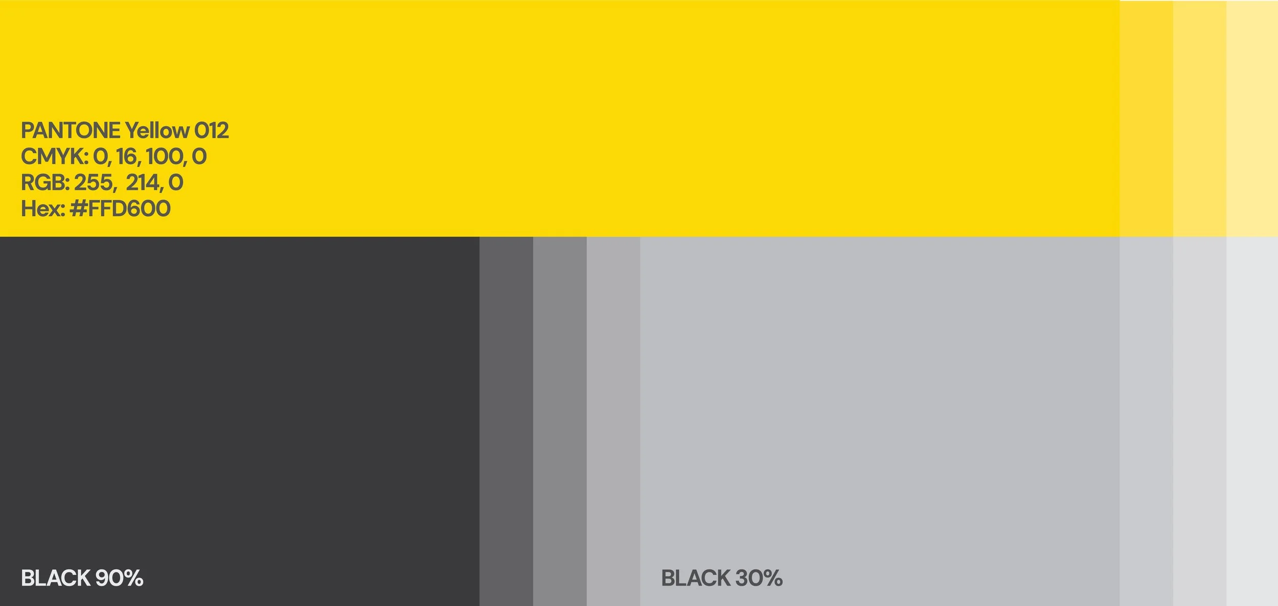
The final brand identity is deliberately bold and minimal. The logo acts as a confident, expressive anchor, edgy but restrained, representing a brand that stands firm without shouting. It reflects Emily’s independence while remaining adaptable enough to support long-term growth. The colour palette is stripped back to black and white for clarity and contrast, with a sharp pop of yellow used sparingly to inject energy and disruption. Typography is clean and modern, chosen to support storytelling and legibility while leaving space for more expressive elements to lead. Every component was refined with intention, ensuring the system felt cohesive, flexible, and aligned, never imposed.


Visual language and imagery
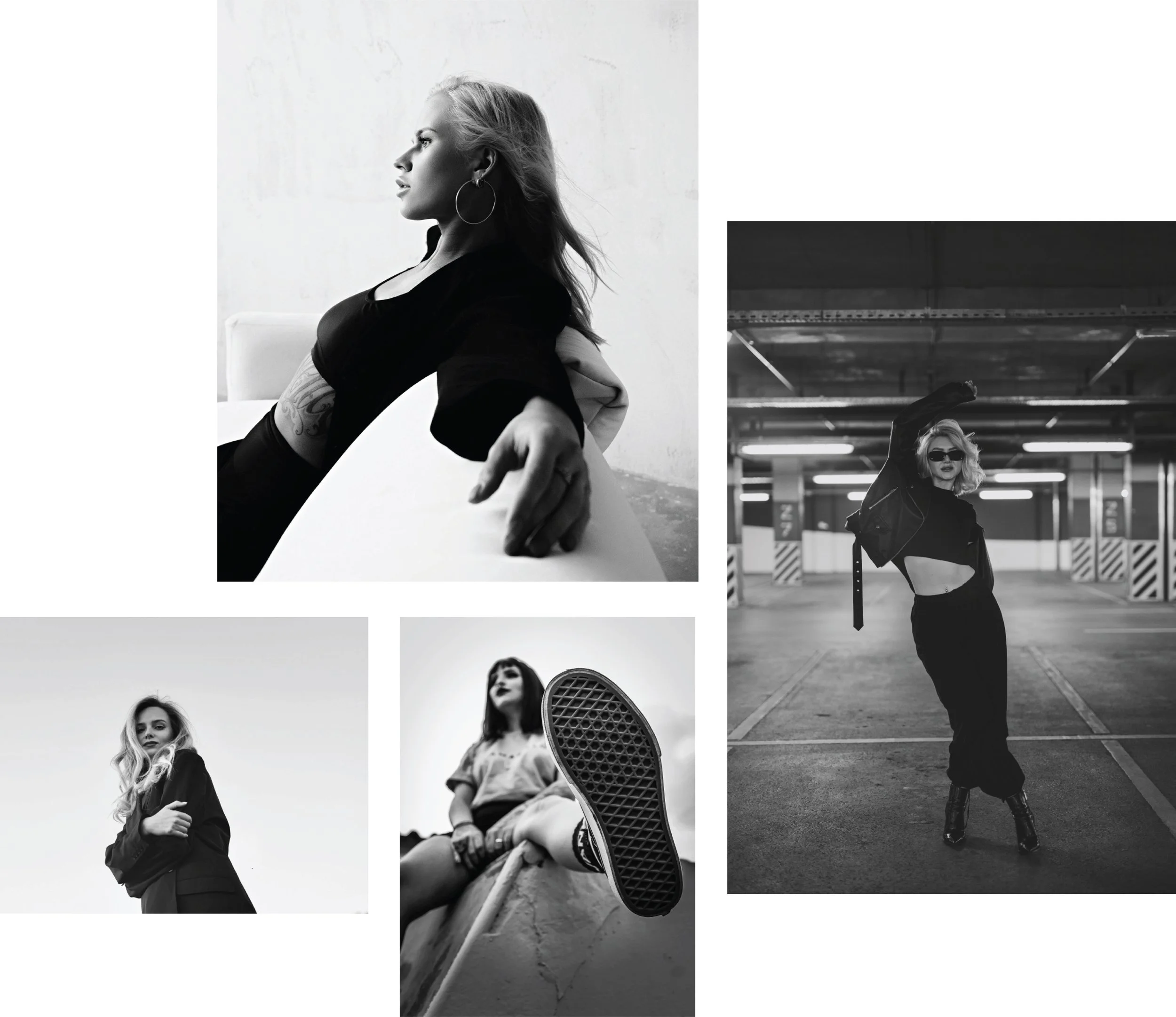
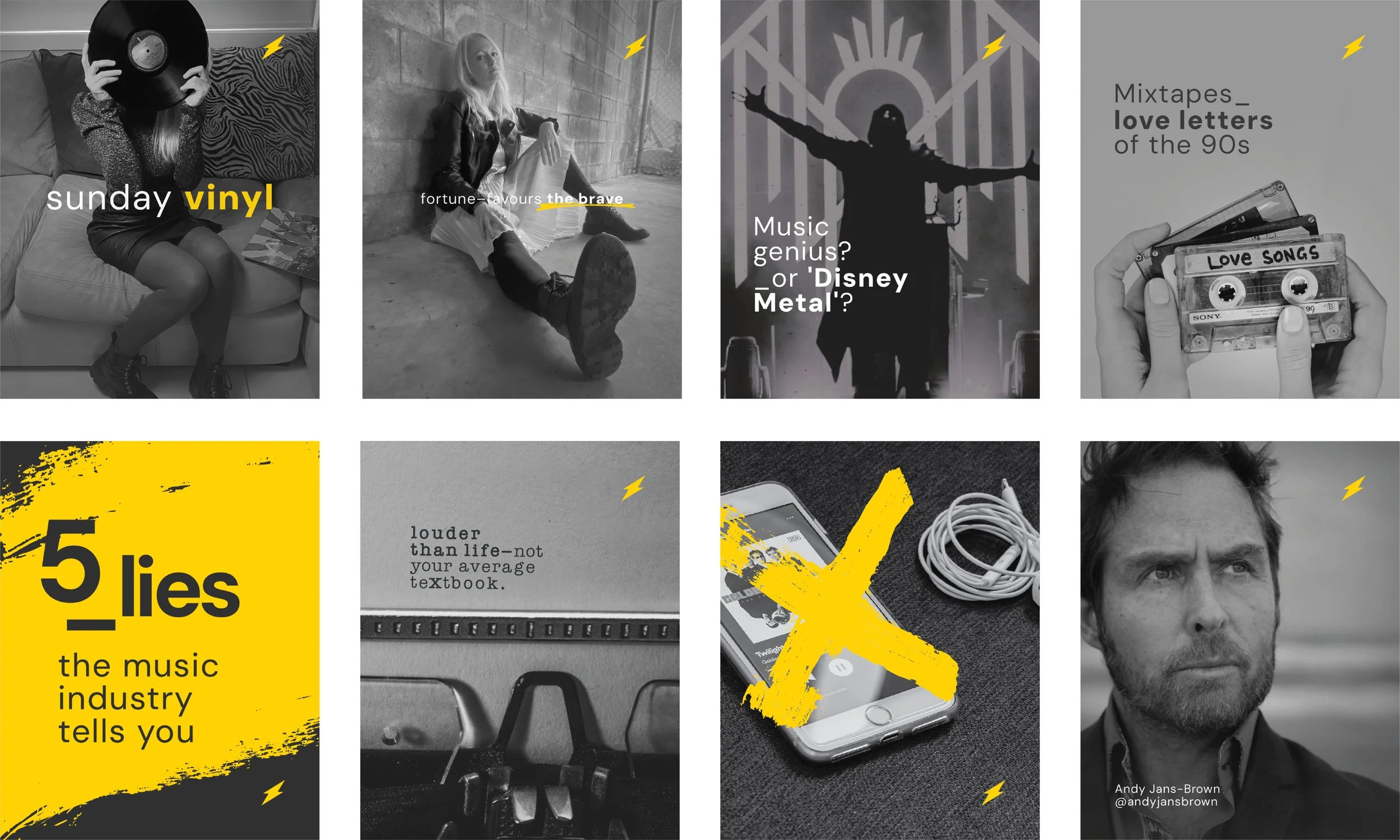
Photography was treated as an extension of the brand voice, not decoration. Black and white portrait photography centres Emily herself, presence, expression, and authenticity, reinforcing trust while maintaining edge. Supporting imagery leans into music, process, and creative culture, chosen to feel lived-in rather than staged. Hand-drawn marks, scribbles, and graphic interventions bring energy and imperfection into the system, helping the brand feel human, expressive, and engaging without losing clarity or consistency.

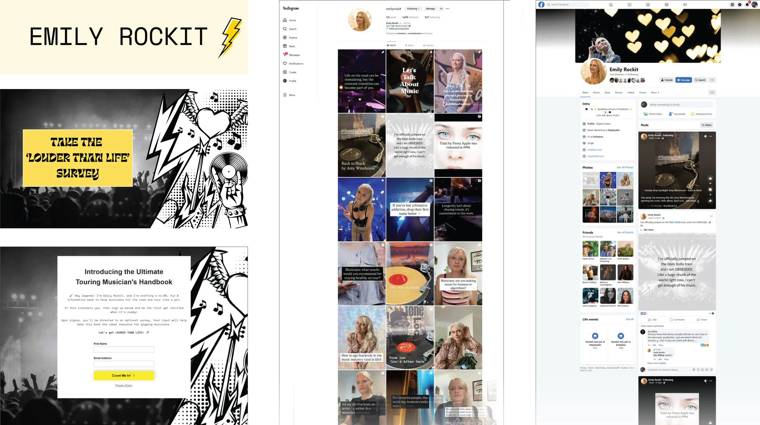
Application
The brand was designed to work where it actually lives. Early applications focused on social content and messaging, testing how the identity could support conversation, opinion, and long-form thinking. The system allows Emily to show up consistently without feeling boxed in, providing tools rather than templates. With clear foundations in place, the brand can now expand confidently across future offerings, collaborations, and platforms, always aligned, always recognisable.
The outcome
Emily Rockit now has a brand that:
Clearly reflects who she is and what she stands for
Communicates her message with confidence and cohesion
Engages the right audience without compromise
Has room to evolve as the work grows
This wasn’t branding for attention.
It was branding for alignment, clarity, and impact.
A final note
Strong brands don’t dilute strong voices. They give them structure, clarity, and space to be heard. If you’re building something you believe in, but your brand isn’t quite carrying it yet — that’s usually not a marketing problem. It’s a clarity one.